Showing posts with label metro areas. Show all posts

Monday, September 28, 2020

JOB LOSS | U.S. Metro Areas, July 2020

What metro areas are suffering most and least from job loss as of July 2020? 

Most loss: New York State. Three of the five metro areas suffering most from a loss of jobs over the last five years are in New York State. The New York City metro area lost 8.4 percent of its jobs between July 2015 and July 2020.

Least loss: Sunbelt Cities. Low-density sunbelt metro areas have had the least loss of jobs, like Austin, Texas; Phoenix, Arizona; Jacksonville, Florida; Salt Lake City, Utah; and Nashville-Davidson, Tennessee.

Were July Metro Jobs Higher than Five Years Ago? Most Were Lower.

Percent change in employment, 49 metro areas with Census 2010 population of 1 million or more, July 2020, not seasonally adjusted. Ranked by 5-year % change.

Metropolitan area

10 year

5 year

1 year

Rochester, NY

-7.8

-11.2

-13.0

New Orleans-Metairie, LA

-3.4

-11.1

-11.4

Buffalo-Cheektowaga-Niagara Falls, NY

-4.8

-9.0

-10.2

Cleveland-Elyria, OH

-3.6

-8.8

-11.9

New York-Newark-Jersey City, NY-NJ-PA

0.3

-8.4

-13.6

Boston-Cambridge-Nashua, MA-NH NECTA

2.2

-6.9

-12.1

Detroit-Warren-Dearborn, MI

4.5

-6.7

-11.3

Pittsburgh, PA

-3.8

-6.4

-8.8

Milwaukee-Waukesha-West Allis, WI

-0.1

-5.8

-7.7

Providence-Warwick, RI-MA NECTA

0.9

-5.4

-8.2

Hartford-West Hartford-East Hartford, CT NECTA

-0.9

-5.3

-7.2

Chicago-Naperville-Elgin, IL-IN-WI

3.6

-5.0

-8.3

Los Angeles-Long Beach-Anaheim, CA

5.8

-4.0

-10.1

Minneapolis-St. Paul-Bloomington, MN-WI

6.7

-3.7

-8.7

Philadelphia-Camden-Wilmington, PA-NJ-DE-MD

0.9

-3.3

-8.6

Baltimore-Columbia-Towson, MD

4.1

-3.2

-6.9

Memphis, TN-MS-AR

3.7

-2.5

-6.0

St. Louis, MO-IL

3.1

-2.4

-5.6

Columbus, OH

11.2

-2.3

-8.8

San Diego-Carlsbad, CA

9.2

-2.3

-9.7

San Francisco-Oakland-Hayward, CA

14.9

-2.2

-11.3

Cincinnati, OH-KY-IN

6.7

-1.8

-6.4

Louisville/Jefferson County, KY-IN

8.3

-1.7

-6.8

Richmond, VA

8.0

-1.6

-6.7

Las Vegas-Henderson-Paradise, NV

12.3

-1.2

-12.6

Houston-The Woodlands-Sugar Land, TX

15.3

-1.0

-6

Birmingham-Hoover, AL

4.4

-0.9

-5.3

Kansas City, MO-KS

8.9

0.1

-4

Oklahoma City, OK

12

0.4

-3.5

Miami-Fort Lauderdale-West Palm Beach, FL

15.2

0.5

-7.6

San Jose-Sunnyvale-Santa Clara, CA

21.4

0.7

-8.2

Sacramento--Roseville--Arden-Arcade, CA

11.7

0.8

-8.9

Portland-Vancouver-Hillsboro, OR-WA

15.3

1.1

-7.8

Seattle-Tacoma-Bellevue, WA

15.7

1.8

-8.2

Raleigh, NC

19

2.9

-8.4

Indianapolis-Carmel-Anderson, IN

15.2

3.0

-3.6

Riverside-San Bernardino-Ontario, CA

22.5

3.9

-9.4

San Antonio-New Braunfels, TX

20.5

4.0

-4.7

Denver-Aurora-Lakewood, CO

21.7

4.1

-5.6

Orlando-Kissimmee-Sanford, FL

21.6

4.2

-8.9

Charlotte-Concord-Gastonia, NC-SC

22.3

4.3

-7.0

Atlanta-Sandy Springs-Roswell, GA

18.8

4.9

-4.8

Tampa-St. Petersburg-Clearwater, FL

20.0

6.1

-4.2

Dallas-Fort Worth-Arlington, TX

24.1

6.6

-4.0

Nashville-Davidson--Murfreesboro--Franklin, TN

28.9

6.9

-6.7

Salt Lake City, UT

23.0

7.2

-3.9

Jacksonville, FL

20.5

8.2

-3.5

Phoenix-Mesa-Scottsdale, AZ

24.4

9.9

-3.5

Austin-Round Rock, TX

37.6

11.4

-4.0


Covid-19 has raised questions about the value of density, although the average wage of workers is linked to population or employment density. This has been tied to skill density, commonly defined as the share of the local population with a college degree. 

The "density is destiny" theory implies that the main effort of government officials seeking prosperity for their communities should be to attract, train and keep skilled workers. 

Agglomeration theory, as outlined by Rosenthal and Strange, encourages the idea that a dense city population means a high level of skills, which encourages work force productivity and higher average wages. This theory is based on the idea that people vote with their feet, as first described by Charles Tiebout in a 1956 article, by moving to places where there are more government-provided goods. These tend to be in certain parts of prosperous cities, with top-rated public schools. The same goes for clusters of local private goods, as demonstrated in a 2006 paper by Joel Waldfogel. Being near good restaurants is worth something, or it was before Covid-19 exploded.

The idea of agglomeration is linked to Adam Smith’s concept of quality skills requiring a critical mass of market size or extent: 
“As it is the power of exchanging that gives occasion to the division of labor, so the extent of this division must always be limited by… the extent of the market. When the market is very small, no person can have any encouragement to dedicate himself entirely to one employment… A country carpenter deals in every sort of work that is made of wood…” (Wealth of Nations, I:3)
A city’s size creates demand for high-quality specialized services, and the demand creates the supply of skills that attracts those who care about quality. 

What first determined a city’s size? Adam Smith noted the importance in his time of water transportation. He noted that European cities grew up because they could trade with one another in the sheltered harbor of the Mediterranean. He also noted that:.“[I]n our North American colonies the plantations have constantly followed either the sea-coast or the banks of the navigable rivers,” because water transportation was then the cheapest form of moving goods and people. 

Harvard Professor Edward Glaeser observes that in 1990 the 20 most populous U.S. cities were all on water. As railroads opened up the interior of the United States, railroad terminals became as important as ports. Manufacturing located near the terminals, so that as late as 1950 seven out of the eight largest cities, including New York, were manufacturing centers based on employment concentration relative to the nation. 

With the spread of national highways and car ownership, the railroads diminished in importance. People moved inland to sun and sprawl, to what Glaeser calls “consumption cities” designed for leisurely living. By 1990, manufacturing had decentralized (and shrunk), to the point where six of the eight largest U.S. cities had a lower-than-average share of manufacturing employment. City size is no longer being determined by the cheapness of water transportation, or the importance of railway terminals, or the existence of manufacturing.

All of these ideas will be subject to review as we rethink cities under the shadow of Covid-19. 

Notes
1. Agglomeration: S. S. Rosenthal and W. C. Strange, “Evidence on the Nature and Sources of Agglomeration Economies,” in J.V. Henderson and J.-F. Thisse, eds., Handbook of Urban and Regional Economics, Vol. 4. Amsterdam: Elsevier, 2004, 2119-2172.
2. Vote with Their Feet: Charles Tiebout, “A Pure Theory of Local Expenditures,” The Journal of Political Economy, 64(5) (Oct 1956), 416-424. 
3. Local Private Goods: Joel Waldfogel, Wharton School, Univ. of Pennsylvania, “The Median Voter and the Median Consumer: Local Private Goods and Residential Sorting,” Preliminary Draft, November 22, 2004, 25-26. Types of restaurants indicate nearby clientele.
4. Division of Labor Adam Smith, An Inquiry into the Nature and Causes of the Wealth of Nations. Edwin Cannan, ed. Book 1, Chapter 3, “That the Division of Labor is limited by the Extent of the Market,” para. 1. www.econlib.org/library/Smith/smWN.html,
5. Smith, Book 1, Chapter 3, para. 4. 
6. Remarks to the Manhattan Institute, New York City, January 10, 2006.

Wednesday, October 12, 2016

VEGGIE DIET | Metros with the V-Restos

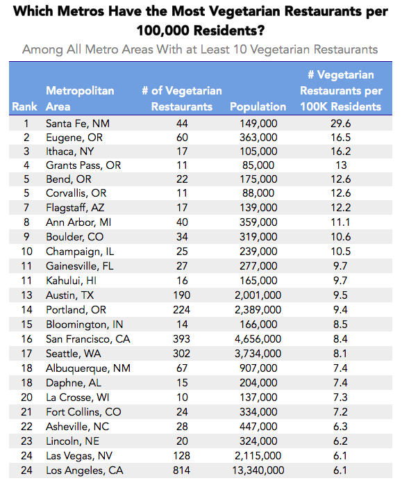
Pricenomics has just posted a list of the 50 metro areas with the most vegetarian restaurants.  Not surprisingly, the New York City metro area (CSMA? Metro Division?) has the most at 1,026, followed by LA with 814, and then San Francisco with 393.

This is not as interesting a number as the number of veggie restos per capita, i.e., relative to the metro area population.

Pricenomics has ranked metro areas by the number of vegetarian restaurants they offer per 100,000 residents, provided the metro area has at least ten vegetarian restaurants. Now most of the big eastern cities drop out (Ithaca, NY being an exception) and littler ones in states like NM, OR, AZ take over.

Wednesday, May 2, 2012

JOBS | March Metros Index–93.8 and 73.1, Slower Growth


Metro Jobs in March showed a diffusion index of 93.8 for unemployment and 73.1 for payroll jobs. The BLS reported the numbers today:
Unemployment rates were lower in March than a year earlier in 342 of the 372 metropolitan areas, higher in 16 areas, and unchanged in 14 areas.... [Also,] 267 metropolitan areas reported over-the-year increases in nonfarm payroll employment, 96 reported decreases, and 9 had no change. The national unemployment rate in March was 8.4 percent, not seasonally adjusted, down from 9.2 percent a year earlier.
The trouble with this method of reporting is that the monthly data come in clusters of three. A diffusion index provides a single number showing how metros have done. Using the same weights as the Conference Board, the numbers that get better get a 1 and the numbers that get worse get a zero; the number of unchanged metros get a 0.5. That makes for an unemployment diffusion index of (342+7)/372 = 93.8 percent of metros showed a favorable direction.

But the corresponding index for nonfarm payroll jobs would be (267+4.5)/372 = 73.0 percent. In other words, in 73.0 percent of metros, payroll jobs showed a favorable direction (they grew). This doesn't sound so encouraging. Job growth is too slow.  

It makes a difference how the numbers are presented. If a single number fairly reports multiple numbers without much loss of information from the aggregation, the public is better off. Better public understanding of the data makes for better policies.

Tuesday, December 2, 2008

JOBS | Dismal News for U.S. Metro Areas

I posted this a few hours ago on Huffington Post. Unemployment tends to lower tax revenues to states and localities and raises expenditures, so it's one of the contributors to the fact that 41 states are facing budget gaps, some of them daunting.
When the Governors appealed to President-elect Obama for help today, they had support from today's Bureau of Labor Statistics release of dismal October unemployment data for metro areas.

Metro area unemployment rates (not seasonally adjusted) in October were above the October year-earlier rates in 361 metro areas and below in only eight. Unemployment rates exceeded 10 percent in 13 metro areas and were below 3 percent in 11. (The national unemployment rate in October rose to 6.1 percent from 4.4 percent a year earlier.

Unemployment exceeded 7 percent in 98 metro areas, increasing from 16 areas a year earlier. They were below 4 percent in 43 areas, a drop from 151 a year earlier. The highest unemployment was in El Centro, Calif., 27.6 percent. Next highest was in neighboring Yuma, Ariz., 19.5 percent. The lowest unemployment rate was in Bismarck, N.D., 2.2 percent. Next lowest: Logan, Utah-Idaho, at 2.4 percent.

Overall, 148 areas exceeded the U.S. average rate of 6.1 percent and 216 areas reported rates below the U.S. average. This suggests that metro areas on the whole remain better places to find jobs than rural areas.

El Centro, Calif., had the largest increase in unemployment from a year earlier, 6.8 percentage points. The next-highest increase was in Elkhart-Goshen, Ind., 6.3 points. A total of 33 areas had increases of 3 percentage points or more. Another 92 areas had increases of 2.0 to 2.9 points. Jonesboro, Ark., fell the most from a year earlier, -0.6 percentage point.

Of 49 metro areas with a 1 million or more population, Riverside-San Bernardino-Ontario, Calif. had the highest rate, 9.5 percent. Eight other large areas posted rates of 7 percent or more. The large area with the lowest rate was Washington-Arlington-Alexandria, D.C.-Va.-Md.-W.Va., 4.1 percent. Next lowest: Oklahoma City, Okla., 4.2 percent.

All 49 large areas registered higher unemployment rates than a year earlier. The area with the largest increase was Providence-Fall River-Warwick, R.I.-Mass. (+3.8 percentage points). Next largest: Riverside-San Bernardino-Ontario, Calif. (+3.2 points). Fourteen other large areas had rate increases of 2 percentage points or more, and 29 other areas had rate increases of at least 1 point.